


36 Days of Type is a project that invites Designers, Illustrators and Graphic Artists to express their particular view on letters and numbers of our alphabet.
36 days of restless creativity, where participants are challenged to design a letter or number each day, resulting an outcome of ability to represent the same symbol from many different perspectives.
WHY
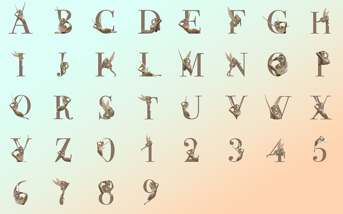
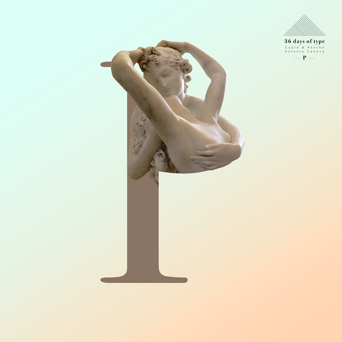
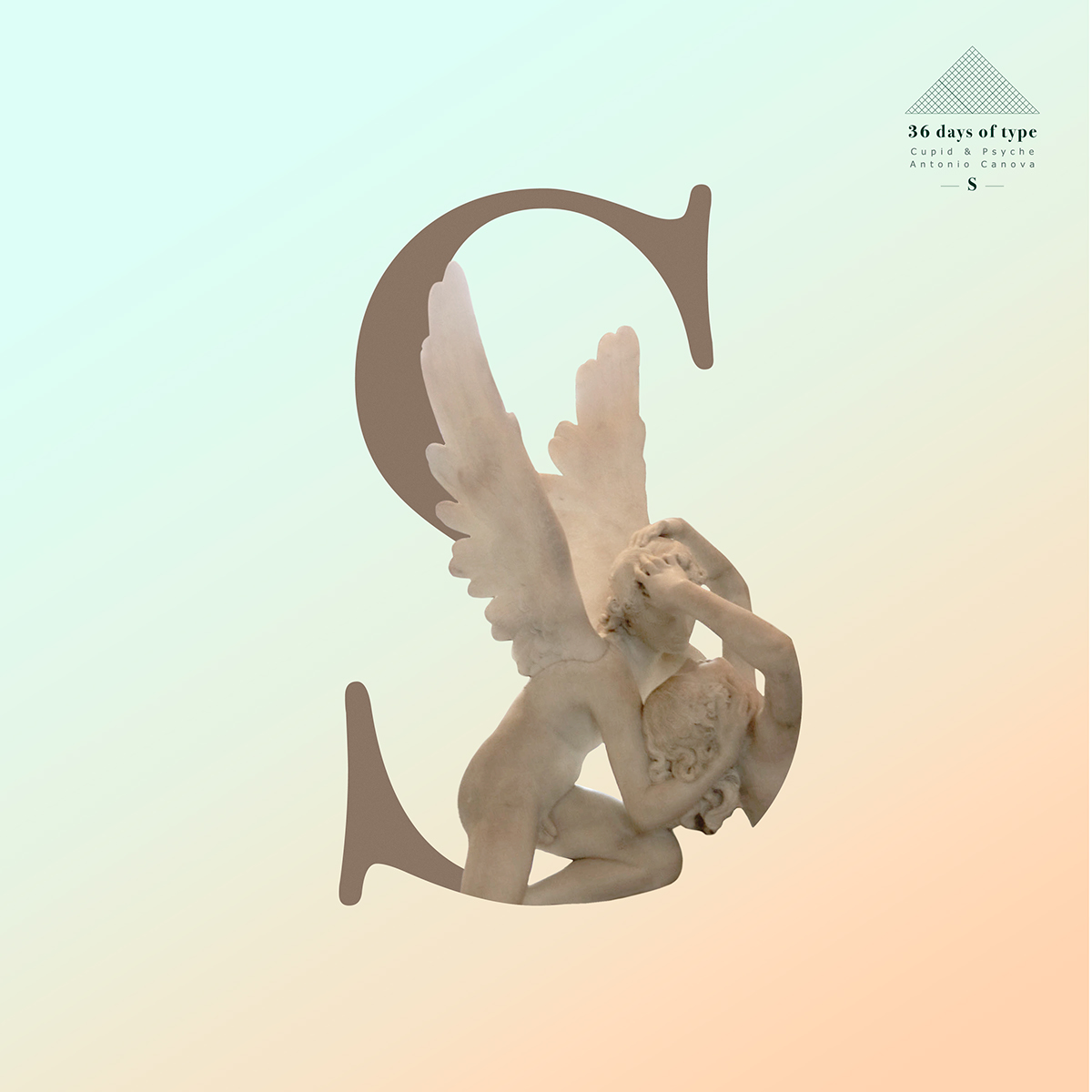
I wanted to do a double exposure Typography Set based on a sculpture from Musée du Louvre, however the huge amount of sculptures made the decision quite difficult.
At the beginning I wanted to use different sculptures for each letter, however I realized it could be far more interesting to create a typography set based on just one sculpture, since the possibilities of creating shapes were smaller, making the design more laborious. At the same time, each sculpture tells us a different story with a different kind of vibe, so using just one sculpture would made my project a more homogenous work.
I highly admire Antonio Canova’s work and I have always love the sculpture of “Psyche Revived by Cupid's Kiss”, so when I started photographing it something clicked, this was it!
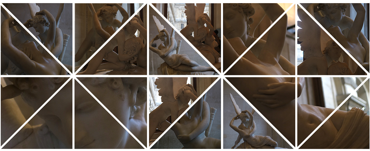
Despite the cloudy day and the lack of a good illumination in the room, I obtain well enough exposed images for editing,
which made the following process much easier.
HOW
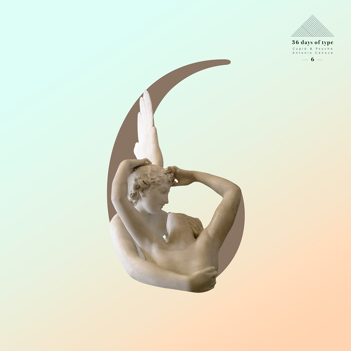
As a historian and photographer I wanted to combine the story behind the sculpture with my designs. The sculpture tells us the love story of Cupid and Psyche, that’s why I decided to give it a romantic vibe, choosing colours and shapes that answer this necessity. The limited shapes of the sculpture made extremely difficult to combine it with the characters. Even though it has been a hard work, I’ve had an amazing time working on this project, discovering every time different details of the sculpture.
Hope you enjoy it as much as I did working on it!


COLOUR SELECTION
The natural desaturated marble colour of the sculpture made particularly difficult to decide which tones and colours should be used. I found that a darker vanilla colour blended perfectly fine with the sculpture, creating homogeneous characters for the full project.


BACKGROUND
I didn’t want a flat background, so the gradient colour was always on my mind.
However, until I started working on the design I didn’t noticed how cool it looked the combination of warm and chill colours, in the same line of tone, with the sculpture. That’s why I decided to use a soft turquoise with a peachy pink tone.


STAMP
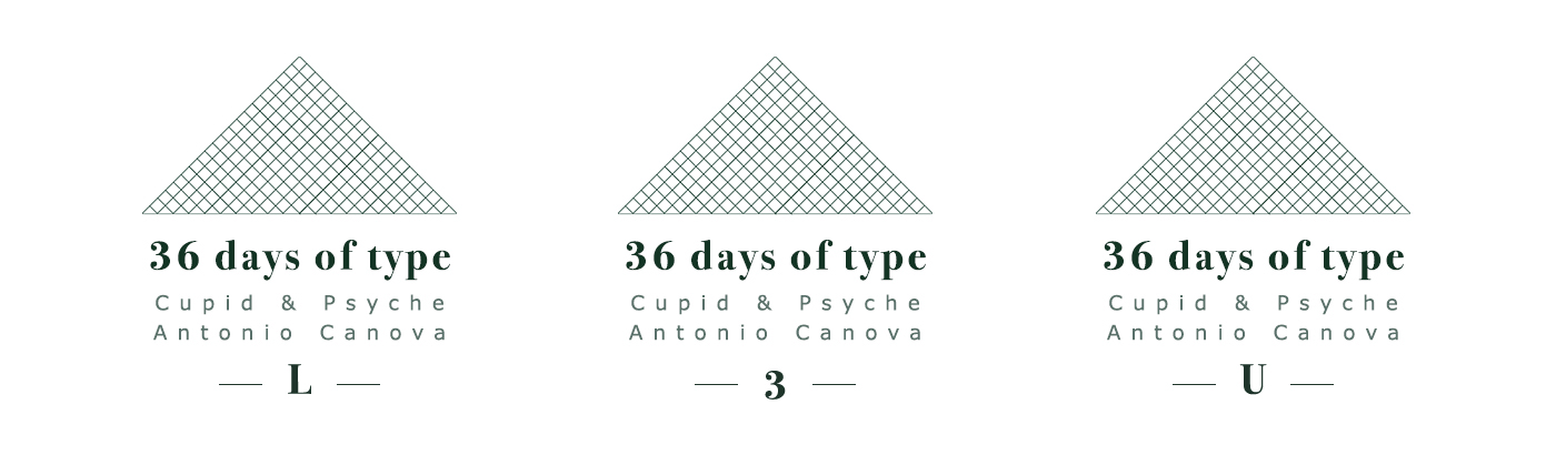
I wanted the same stamp for each character, with the variation between letters or numbers.
I decided to use the Louvre pyramid as the main shape in honour to the Museum that has kept the sculpture for almost 200 years.
To see the full project please visit my instagram page


